

Gain Control Curves
Cantabile supports various Gain Control Curves. The Gain Control Curves determine how Cantabile responds to the movement of a gain slider. Different curves provide different top end gain and different sensitivies at different parts of the curve.
Selecting Control Curves
In Options → Keyboard and Control there are a three different settings that determine which control curve to use in various situations:
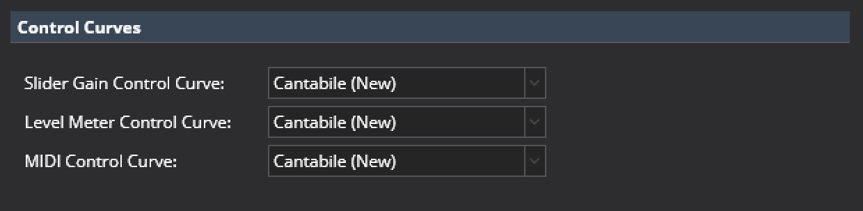
Built-in Control Curves
Cantabile includes 4 built-in control curves:
- Cantabile (Classic)
- The same control curve as older builds of Cantabile which has a range from silent up to +14dB. It also includes a hard coded flat point around 0dB for snapping.
- Cantabile (Classic MIDI)
- The same control curve as older builds of Cantabile for MIDI bindings to control curves. This is a linear curve against a dB scale from -60dB to +14dB.
- Cantabile (New)
- A new curve that provides more precise control and ranges from silent up to 7.3dB with the 0dB level 3/4 of the way along on the slider. When used with MIDI bindings, a CC value of 96 maps to 0dB.
- Cantabile (0db Center)
- The same curve as above but with the 0dB position moved to the center of the slider giving a higher top end gain of about 18dB. A MIDI CC value of 64 maps to 0dB.
Custom Control Curves
Cantabile also supports custom control curves by authoring a curve definition file.
A curve definition file is a text file that includes math expressions that define how to map between a slider position and an amplitude gain and vice versa. They also include information on where to display slider tick marks and level meter color locations.
Control curve files have a file extension of ".cantabileControlCurve" and the four standard curves can be found in the Cantabile's installation folder. They can also be viewed here.
The control curves are located by looking in two locations.
- The Resource Folder (see Options → File Locations)
- The same folder where Cantabile is installed
If a file with the same name is found in both locations, the one in the resource folder is used.
Each file must be a properly formatted JSON file although Cantabile's JSON parser also allows for Javascript style comments. The file is divided into two main sections "definitions" and "uiKinds".
"definitions" Section
The definitions section defines a set of functions and constants. It can include as many different definitions as you like however it must include two functions "positionToScalar(x)" and "scalarToPosition(x)", as shown in the following example:
"definitions":
{
	// All control curves must provide these two functions
	// (which must be the inverse of each other else weirdness will ensue).

	//  - Position ranges from 0.0 → 1.0 and represents the slider position
	//  - Scalar is the amplitude scaling (ie: linear multiplier)

	"positionToScalar(x)": "pow(10, (log(x, 10) * slope - (log(zeroDbPos, 10) * slope)) / 20)",
	"scalarToPosition(x)": "pow(10, (log(x, 10) * 20 + (log(zeroDbPos, 10) * slope)) / slope)",

	// Higher value makes the slope of the curve steeper and gives a higher top gain level
	"slope" : 60,

	// Position of the 0 dB mark
	"zeroDbPos": "96/127",
},
These functions translate between two systems: a position and a scalar:
- Position - refers to the position of the knob on the slider where 0.0 is the far left and 1.0 is the far right.
- Scalar - amplitude scale factor (linear scale, not in dB)
The two required functions must be the inverse of each other otherwise unusual slider behaviour will result.
The other functions and constants in the definition section are for convenience only and can be referenced by the two required functions.
Not that literal numeric values can be explicitly stated (eg: the slope property above), but expressions must be quoted (eg: the zeroDbPos above)
For details on writing expressions and the set of available functions, see the Expression Reference.
"uiKinds" Section
The uiKinds section includes additional information for different elements in Cantabile's user interface and is further broken down into three sections:
horizontalSlider- the smaller always visible version of the horizontal sliderhorizontalSliderPopup- the popup temporary view of the slider when clicked onlevelMeter- level meter indicators
Within each section is a set of "ticks", each with the following properties:
kind-major,minor,hotStart,hotEndorclipIndicator(see below)scalar- the position of the tick in scalar units (can be an expression referencing anything in the definitions section)label- the label displayed on the tick marksnap- whether to snap to this tick when using the slider in snapping mode (Ctrl key pressed). Defaults totrue.
The kind setting determines the type of tick mark:
major- a major tick markminor- a minor tick mark (displayed smaller)hotStart- the position on a level meter at which the level meter indicator starts to turn orangehotEnd- the position on a level meter at which the level meter is fully orangeclipIndicator- the position on a level meter at which the clip indicating border lights up
Here is an example:
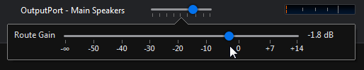
"uiKinds":
{
"horizontalSliderPopup":
{
"ticks":
[
{ "scalar": 0, "label": "-\u221E", "kind": "major" },
{ "scalar": "fromDb(-45)", "label": "-45", "kind": "minor" },
{ "scalar": "fromDb(-30)", "label": "-30", "kind": "minor" },
{ "scalar": "fromDb(-20)", "label": "-20", "kind": "minor" },
{ "scalar": "fromDb(-15)", "label": "-15", "kind": "minor" },
{ "scalar": "fromDb(-9)", "label": "-9", "kind": "minor" },
{ "scalar": "fromDb(-6)", "label": "-6", "kind": "minor" },
{ "scalar": "fromDb(-3)", "label": "-3", "kind": "minor" },
{ "scalar": 1, "label": "0", "kind": "major" },
{ "scalar": "fromDb(3)", "label": "+3", "kind": "minor" },
{ "scalar": "fromDb(6)", "label": "+6", "kind": "minor" },
{ "scalar": "fromDb(9)", "label": "+9", "kind": "minor" },
{ "scalar": "fromDb(12)", "label": "+12", "kind": "minor" },
{ "scalar": "fromDb(15)", "label": "+15", "kind": "minor" },
{ "scalar": "fromDb(18)", "label": "+18", "kind": "minor" },
]
},
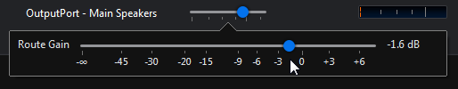
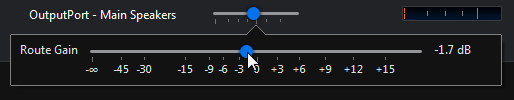
"horizontalSlider":
{
"ticks":
[
{ "scalar": 0, "label": "-\u221E", "kind": "major" },
{ "scalar": "fromDb(-30)", "label": "-30", "kind": "minor" },
{ "scalar": "fromDb(-15)", "label": "-15", "kind": "minor" },
{ "scalar": "fromDb(-6)", "label": "-6", "kind": "minor" },
{ "scalar": 1, "label": "0", "kind": "major" },
{ "scalar": "fromDb(6)", "label": "+6", "kind": "minor" },
{ "scalar": "fromDb(15)", "label": "+15", "kind": "minor" },
]
},
"levelMeter":
{
"ticks":
[
// These get displayed on the level meter as ticks
{ "scalar": "fromDb(-30)", "kind": "minor" },
{ "scalar": "fromDb(-15)", "kind": "minor" },
{ "scalar": "fromDb(-6)", "kind": "minor" },
{ "scalar": 1, "kind": "major" },
// These describe how the transition to hot orange works
{ "scalar": "fromDb(-6)", "kind": "hotStart" },
{ "scalar": "1", "kind": "hotEnd" },
// Hitting this point turns on the border clip indicator
{ "scalar": "1", "kind": "clipIndicator" },
]
}
}