

Controller Bar
Cantabile Performer Only
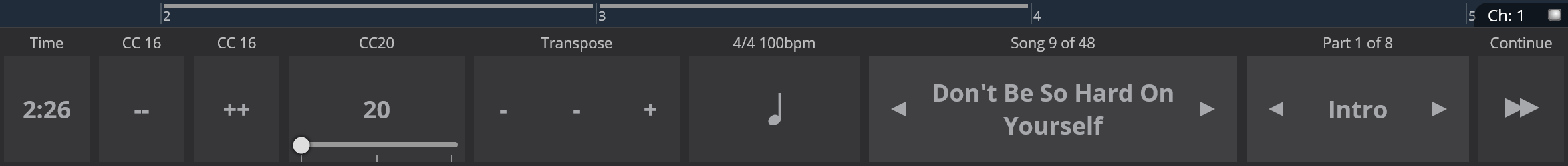
The Controller Bar provides large buttons intended for use during live performance to control key aspects of Cantabile as well as an array of user configurable buttons.
To show the Controller Bar, select "View" menu → "Controller Bar".
Use Configurable Buttons
The left half of the Controller Bar contains a set of user-configurable buttons. By default they're configured to send MIDI program change events (from the on-screen keyboard device) but they can be reconfigured to a wide range of other functions.
To setup a button either right click on an existing button and choose "Customize", or choose "Add Button" to create a new button.
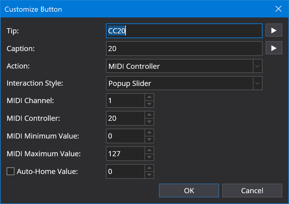
The following settings are available:
- Tip - the text to display above the button
- Caption - the text to display on the button
- Action - the action to invoke when the button is pressed. Includes options to send various MIDI events or to invoke a built in Cantabile command.
- Interaction Style - See below.
- MIDI Channel - for MIDI actions the channel number of the event.
- MIDI Controller/Program/Parameter - depending on the selected event type the controller or parameter number to be sent with the event.
- MIDI Pressed and Released values - MIDI values for buttons when they're pressed and released, or for sliders changes to Minimum and Maximum value.
The interaction style determines how the button responds when it's pressed:
- Button - a simple command button - invokes the selected action when pressed.
- Momentary Button - a button that sends one value when pressed and another when released.
- Toggle Button - a button that sends a different value each time it's pressed.
- Popup Slider - a button that when pressed displays a popup slider.
Dynamic Button Labels
The Tip and Caption fields of custom buttons can use variables to generate dynamic text. When combined with MIDI controller variables this can be used to reflect CC values on the controller bar.
Built In Buttons
The right half of the Controller Bar displays 5 standard controls for common operations during live performance.
Each of these buttons can be optionally hidden if not needed by right clicking on the Controller Bar and clearing the check mark next to the selected item.
- Transpose Button - displays the current song's transpose setting and includes increment and decrement buttons to change the transpose setting. Clicking the middle of this button displays a popup to select a transpose.
- Tempo Button - displays the current song's tempo and flashes in time when the master transport is playing. Tapping this button sets the tempo according to how fast it's tapped.
- Song Picker - displays the currently loaded song in the set list. Arrow buttons can be used to select the next or previous song and tapping the song name displays a popup to select a different song.
- Song Part Picker - displays the currently loaded part in the current song. Arrow buttons can be used to select the next or previous part and tapping the part name displays a popup to select a different part.
- Continue Button - moves to the next song part. If currently on the last part of a song, moves to the first part of the next song.
Resizing and Re-ordering Buttons.
All the buttons in the Controller Bar can be resized by dragging the dividers between the buttons.
The user-configurable buttons can be re-ordered by right clicking a button a choosing "Move Left" or "Move Right".
Layouts
The controller bar supports switching between various user defined layouts, where each layout stores the current set of custom buttons and the visibility of the built-in buttons. You can create as many layouts as you like.
To work with layouts, right click on the controller bar and use the Layouts sub-menu:
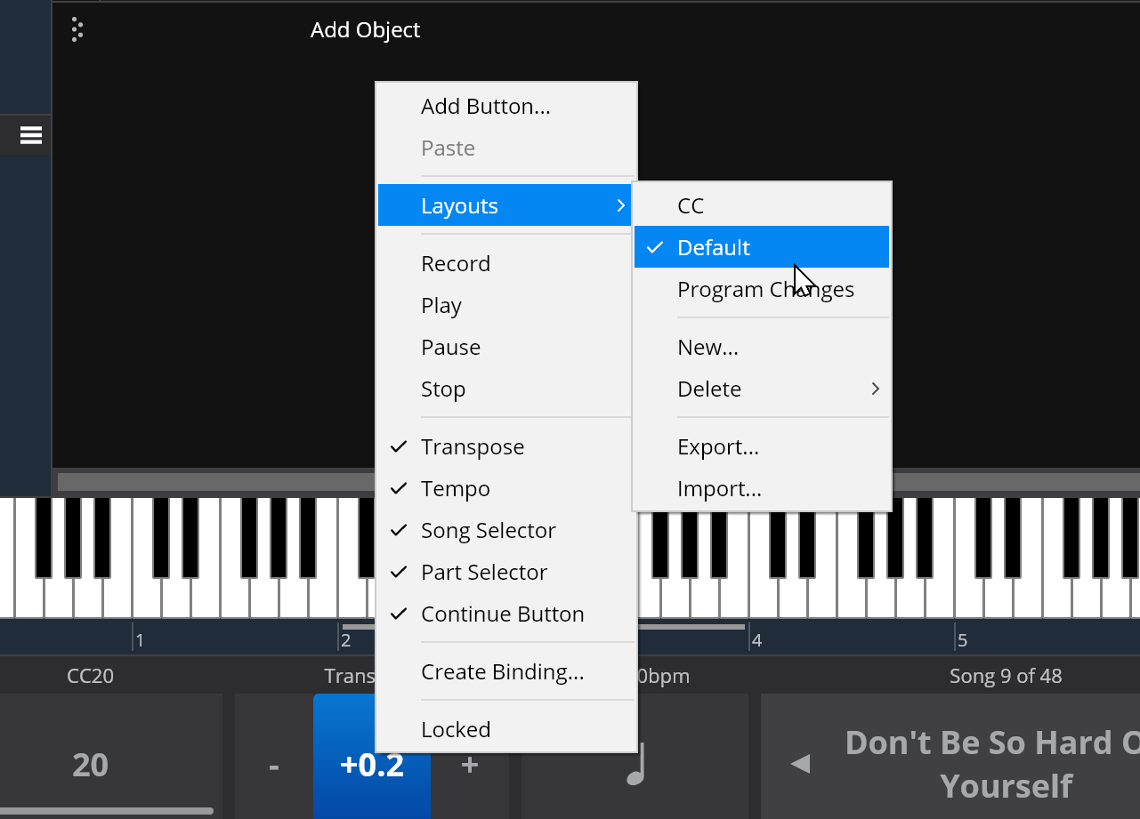
Tip: Live Mode stores which controller bar layout is active so you can have a different active layout for normal vs live mode.