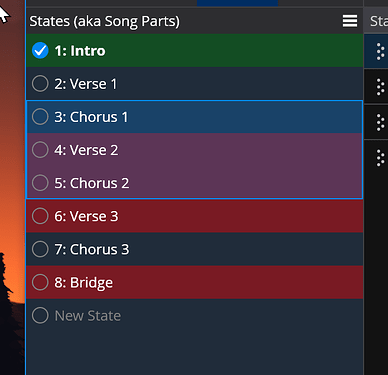
New Selection Indicators
Cantabile's new, cleaner selection indicators.
Cantabile has long let you set colours on songs and states:
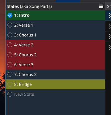
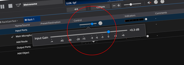
But when they’re selected you can’t see the colours - this is particularly annoying when setting colors since you can’t see the change until you select something else.
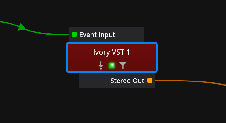
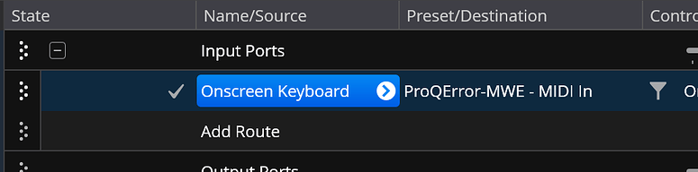
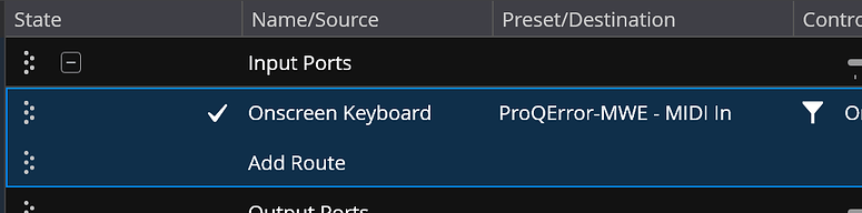
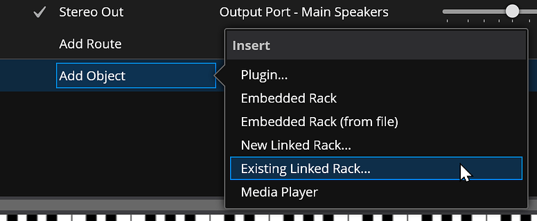
In the routing diagrams this problem is avoided by using a highlight just on the border of the object, allowing the colour to show through:
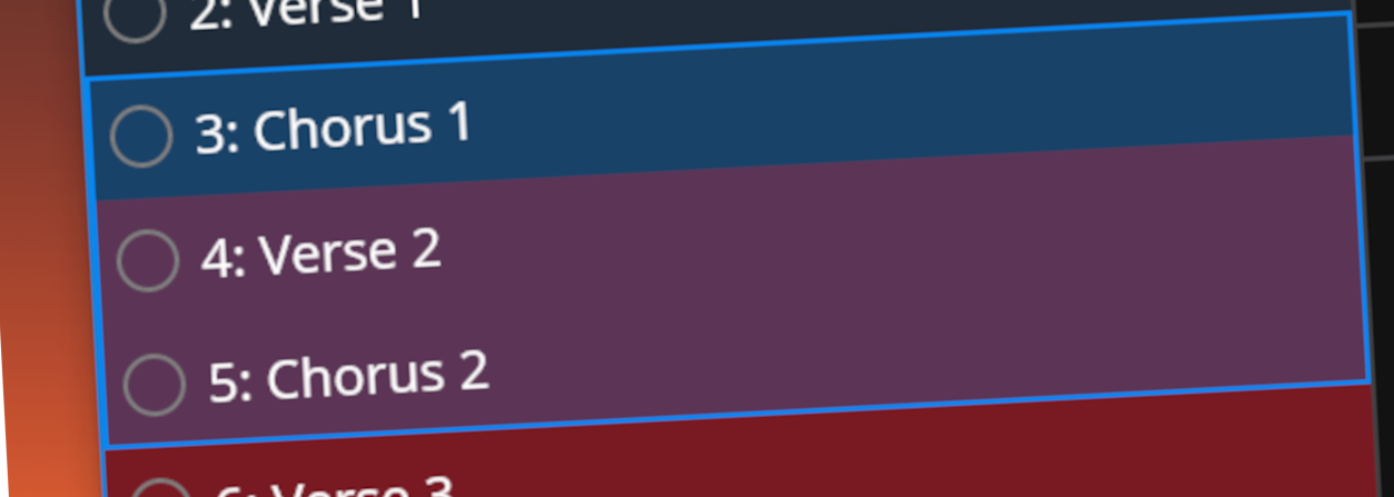
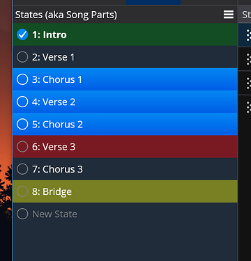
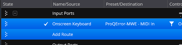
Unfortunately, a similar approach on the side panels looks pretty messy - especially the double width line between each item:
Getting rid of the interior lines and adding a semi-transparent fill cleans things up nicely:
But Now It Doesn't Match
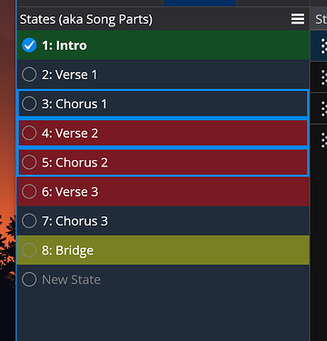
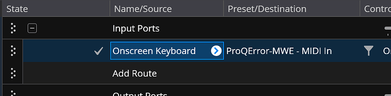
The above looks pretty clean but now it's inconsistent with the selection highlights in the main table area (and many other places):
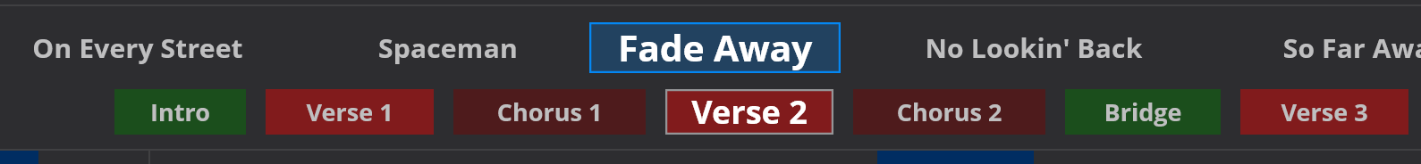
So I've changed everything to the new style:
Ticker Bar Colors
This new selection style also means the ticker bar can now support coloured songs and states:
Available Now
I hope you like the new style - it's available now in build 4184 and later.